NHL Off-Season Thread
Moderators: Bill_Abner, ScoopBrady

-
pk500

- DSP-Funk All-Star

- Posts: 33903
- Joined: Sun Aug 11, 2002 3:00 am
- Location: Syracuse, N.Y.
- Contact:
Not much different from last year's jerseys at all. Sid probably put his foot down: When Sid talks, Reebok listens! 
Take care,
PK
Take care,
PK
"You know why I love boxers? I love them because they face fear. And they face it alone." - Nick Charles
"First on the throttle, last on the brakes." - @MotoGP Twitter signature
XBL Gamertag: pk4425
"First on the throttle, last on the brakes." - @MotoGP Twitter signature
XBL Gamertag: pk4425
Canes Jerseys (previewed in trailers for NHL 08 but officially released now): http://nhllogos.blogspot.com/2007/09/hu ... forms.html
-
pk500
- DSP-Funk All-Star
- Posts: 33903
- Joined: Sun Aug 11, 2002 3:00 am
- Location: Syracuse, N.Y.
- Contact:
Another one without that big of a change other than the shoulder piping, which looks GAY on all jerseys. Maybe all the hideous, garish new sweaters were revealed first, and the NHL and its teams are saving the best for last.
One can only hope!
Take care,
PK
One can only hope!
Take care,
PK
"You know why I love boxers? I love them because they face fear. And they face it alone." - Nick Charles
"First on the throttle, last on the brakes." - @MotoGP Twitter signature
XBL Gamertag: pk4425
"First on the throttle, last on the brakes." - @MotoGP Twitter signature
XBL Gamertag: pk4425
I think the Canes look pretty good. Boston looks the best so far and even Montreal with their classic uni's sort of blew it....they should have gone with the tie down...no excuse to not go with the tie down.
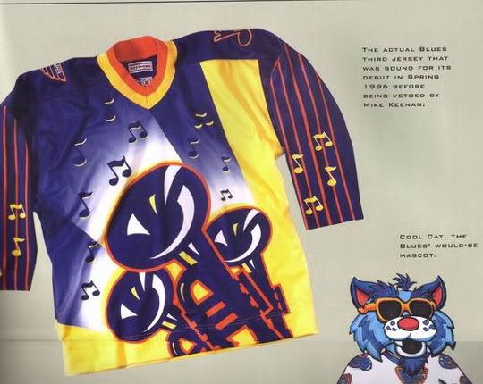
I know the Blues are going to have the striping on the jersey like the Canes and several others but they also have a stripe on their pants...i've seen the pants and you can pretty much tell that stripe is going to lineup with stripes on the jersey. Not happy about it but what can you do...
I know the Blues are going to have the striping on the jersey like the Canes and several others but they also have a stripe on their pants...i've seen the pants and you can pretty much tell that stripe is going to lineup with stripes on the jersey. Not happy about it but what can you do...
Tim
"tjungin it"
PS4 - tjung0831
Xbox - NHLTIM
"tjungin it"
PS4 - tjung0831
Xbox - NHLTIM

They blow...just my 2 cents. Vertical piping should be banned.tjung0831 wrote:I'm not so sure PK is going to like those new oiler jerseys. I don't have a pic but I see them in NHL 08....I'm thinking not.
"Be tolerant of those who describe a sporting moment as their best ever. We do not lack imagination, nor have we had sad and barren lives; it is just that real life is paler, duller, and contains less potential for unexpected delirium." -Nick Hornby


-
pk500
- DSP-Funk All-Star
- Posts: 33903
- Joined: Sun Aug 11, 2002 3:00 am
- Location: Syracuse, N.Y.
- Contact:
Yep, saw those screens at the NHL Tournament of Logos blog. I'm not keen on them at all. I don't mind the simplicity, but yes, the vertical piping is HIDEOUS.
They look like practice jerseys designed by Halston. No thanks.
And why doesn't the arm striping encircle the entire arm? That looks GAY as hell.
Take care,
PK
They look like practice jerseys designed by Halston. No thanks.
And why doesn't the arm striping encircle the entire arm? That looks GAY as hell.
Take care,
PK
"You know why I love boxers? I love them because they face fear. And they face it alone." - Nick Charles
"First on the throttle, last on the brakes." - @MotoGP Twitter signature
XBL Gamertag: pk4425
"First on the throttle, last on the brakes." - @MotoGP Twitter signature
XBL Gamertag: pk4425
-
ScoopBrady
- DSP-Funk All-Star
- Posts: 7781
- Joined: Sun Aug 17, 2003 3:00 am
- Location: Chicago, Illinois
-
pk500
- DSP-Funk All-Star
- Posts: 33903
- Joined: Sun Aug 11, 2002 3:00 am
- Location: Syracuse, N.Y.
- Contact:
Scoop:ScoopBrady wrote:I'm still trying to figure out how the Oilers logo beat out the Blackhawks logo on that Logo Blog.
Even though my love of the Oil permeates my bone marrow, I agree. The Blackhawks' logo isn't just one of the best in hockey; it's one of the best in North American professional sports.
Take care,
PK
"You know why I love boxers? I love them because they face fear. And they face it alone." - Nick Charles
"First on the throttle, last on the brakes." - @MotoGP Twitter signature
XBL Gamertag: pk4425
"First on the throttle, last on the brakes." - @MotoGP Twitter signature
XBL Gamertag: pk4425
I do think the Blackhawks logo is better than the Oilers logo, simply because it looks "classic". However the Oilers logo may have won that poll for a few reasons. 1) more crazy Canadians were voting in that poll than Blackhawk fans, just a hunch. 2) Although it's not as bad as the Cleveland Indians logo it can still easily be seen as offensive and racist. It's a stereotypical characterization of a Native American.ScoopBrady wrote:I'm still trying to figure out how the Oilers logo beat out the Blackhawks logo on that Logo Blog.
Those new Oil jerseys are terrible but still not as bad as the Isles new ones or Buffalo's.
"Be tolerant of those who describe a sporting moment as their best ever. We do not lack imagination, nor have we had sad and barren lives; it is just that real life is paler, duller, and contains less potential for unexpected delirium." -Nick Hornby

-
ScoopBrady
- DSP-Funk All-Star
- Posts: 7781
- Joined: Sun Aug 17, 2003 3:00 am
- Location: Chicago, Illinois
Yeah but this:tjung0831 wrote:Am I the only one that likes the Islanders new jerseys? I think they look great. More orange was needed and even the logo looks better. I really like what the Islanders did.

Doesn't look as bad as these do:
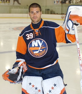

Those are pretty ugly IMO.
I am a patient boy.
I wait, I wait, I wait, I wait.
My time is water down a drain.
I wait, I wait, I wait, I wait.
My time is water down a drain.
-
pk500
- DSP-Funk All-Star
- Posts: 33903
- Joined: Sun Aug 11, 2002 3:00 am
- Location: Syracuse, N.Y.
- Contact:
The Isles' sweaters are the worst among the new unis. Hideous. The best unis are the most simple ones. The Isles' sweaters look like something out of a high school production of "Godspell."
Take care,
PK
Take care,
PK
"You know why I love boxers? I love them because they face fear. And they face it alone." - Nick Charles
"First on the throttle, last on the brakes." - @MotoGP Twitter signature
XBL Gamertag: pk4425
"First on the throttle, last on the brakes." - @MotoGP Twitter signature
XBL Gamertag: pk4425
I love the Islanders new uni's. The Sens are the worst..pk500 wrote:The Isles' sweaters are the worst among the new unis. Hideous. The best unis are the most simple ones. The Isles' sweaters look like something out of a high school production of "Godspell."
Take care,
PK
Tim
"tjungin it"
PS4 - tjung0831
Xbox - NHLTIM
"tjungin it"
PS4 - tjung0831
Xbox - NHLTIM
Probably, with the exception of the Dallas home and both Vancouver sweaters. The Dallas one looks even more high-schoolish than Vancourver. Totally brutal.pk500 wrote:The best unis are the most simple ones.
Blues are also among the worst IMO, but I kinda like the new SJ, even if it looks like nothing like their stuff from years past.